Following my first post, which concentrated on the main Olympic logo of the Tokyo 2020 Olympics, and the three continuous line fish it contained, I now look at related versions of the logo designed by Asao Tokolo and apply my continuous line theories to them.
The Tokyo Olympics 2021 Opening Ceremony culminated in an amazing night time display by 1800 co-ordinated drones. It started with the Olympic logo, designed by Asao Tokolo, outlined by the drones. They developed more rectangles filling in the logo’s centre as it turned into a globe. All continents gradually appeared upon the globe.

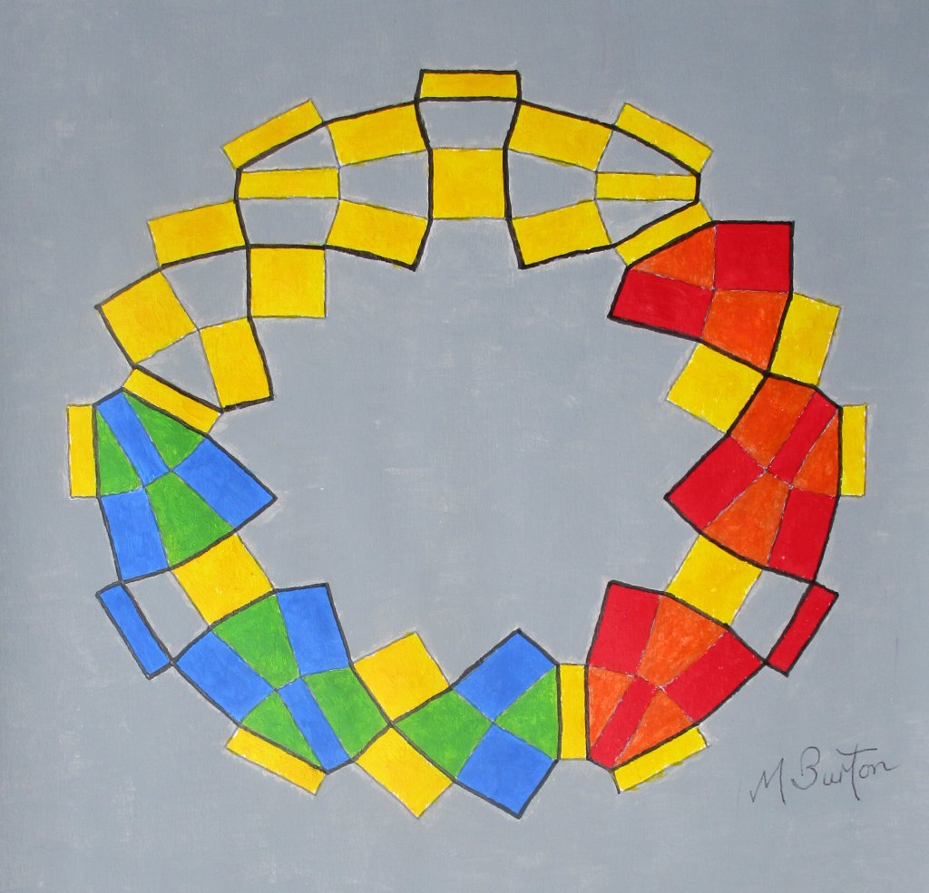
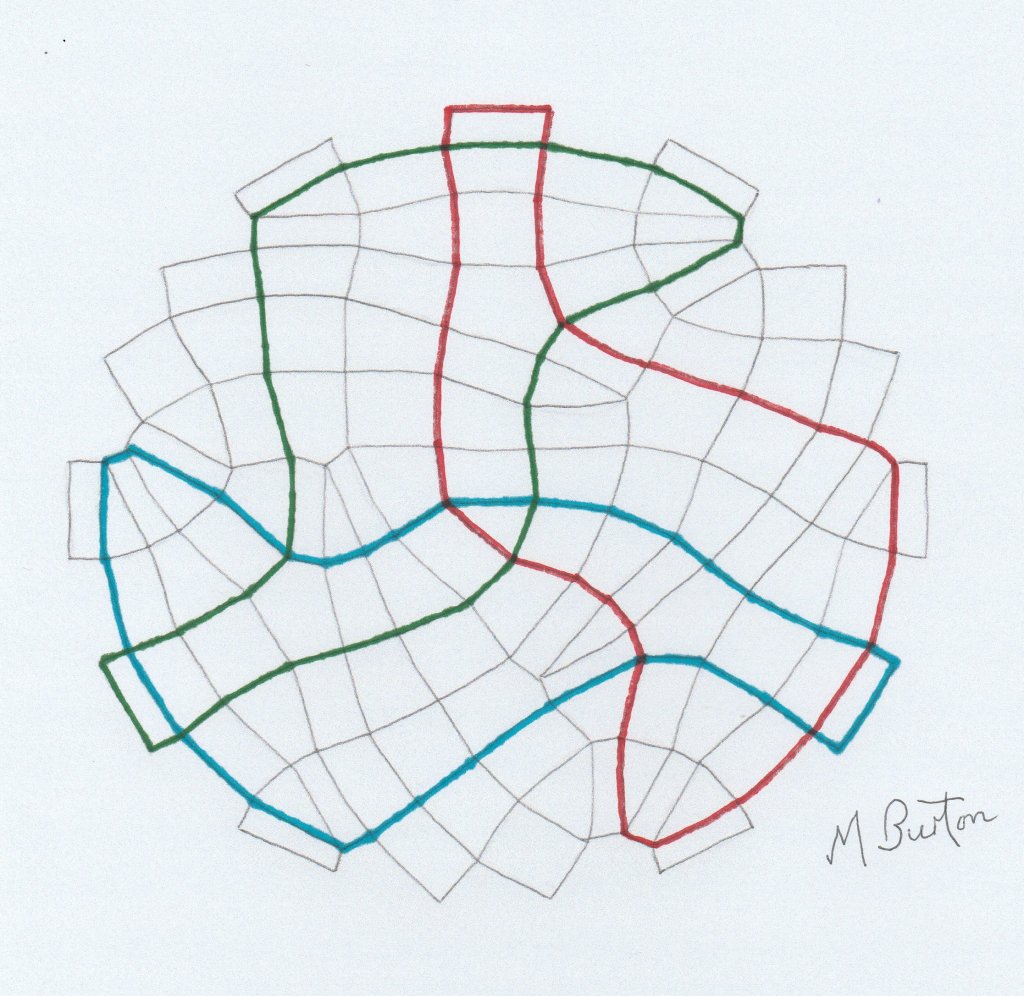
I took this photo on my television at a point where I thought that additional central rectangles more or less connected up in all directions. I could then add these to my previous drawings of Asao Tokolo’s main Olympic logo so that I could then apply my continuous lines to the new full set of connected rectangles.
As you can see from the picture at the top of the post, there are now three minor continuous lines and the rest of the lines from the rectangles make up one larger more complicated continuous line.
In contrast to the three fish following each other clockwise around the main logo (highlighted in my previous post), here we appear to have three foot shapes running clockwise within the logo circuit.
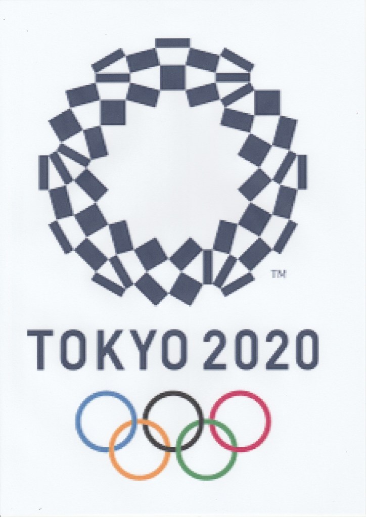
Now we will look at the other main logo, for the Paralympic Games Tokyo 2020.

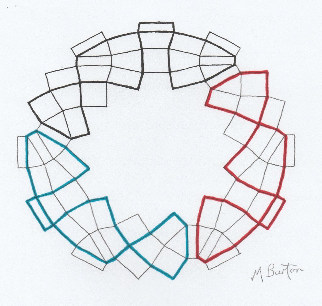
Once more I draw the outlines of all the rectangles and apply my continuous lines.

This time, we have two minor continuous lines in Red and Blue, with the rest of the black lines being one continuous line.
There is a further example of a logo related design and that is the Tokyo Olympic Plate.

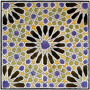
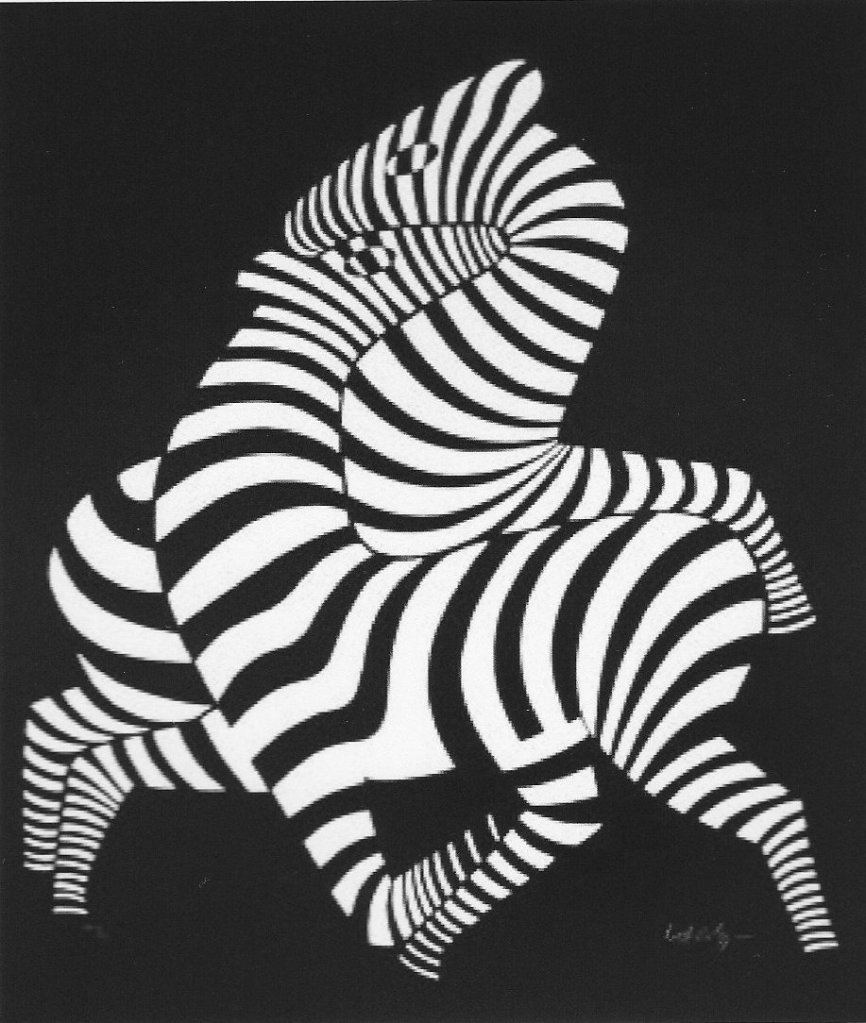
The Plate reminds me of a Zebra painting by Victor Vasarely, from an image he first created in 1937. The intertwined corridors of alternate colouring in both images produces a very similar optical effect. I am confident that Asao Tokolo is also an admirer, as Vasarely was selected to design the Emblem for the Munich Olympic Games of 1972.
Joan has a collection of Olympic Plates and my step daughter Helen Frank swam for Great Britain in the 100 metres Breast Stroke at the Seoul 1988 Olympics.
Anyway, back to the Tokyo 2020 Plate, I have traced the rectangles making up the Plate design and applied my continuous lines as before.

Here we have one minor continuous line in Red within the main continuous line in Black.
In summary, the three drawings in this post, as well as the main logo drawing in the previous post, each have a substantial main continuous line along with one, two or three minor continuous lines.
All the minor continuous lines in this post occur within structures which all form a single mass and every minor continuous line is a simple loop which does not cross over itself and also stretches across the main body of the mass of rectangles.
The main logo in the previous post has the general shape of a Torus (doughnut with hole in the centre). I am not a mathematician, but a simple example of a Torus knot would be a continuous line flowing round and round in one direction in a braided pattern of line.
Our main continuous line (below) forms a largely irregular pattern, flowing round in one direction, which has the three minor continuous lines intertwined within it also flowing round. This results in all the continuous lines bouncing from side to side and crossing over themselves. The minor continuous lines therefore have more pattern, which happens to resemble the repeat pattern of a fish.

Hence my suggestion that these minor patterns can be regarded as traditional Japanese Koi fish swimming around within the Tokyo 2020 Olympic logo, designed by Asao Tokolo.

