On first seeing the final logo design chosen for the Tokyo Olympic Games 2021 (originally 2020) I realised that it was completely made up of rectangles (see below) which joined together at the corners (between 2 and 4 corners used on each rectangle). This indicated to me that one or more continuous lines would run through the design.
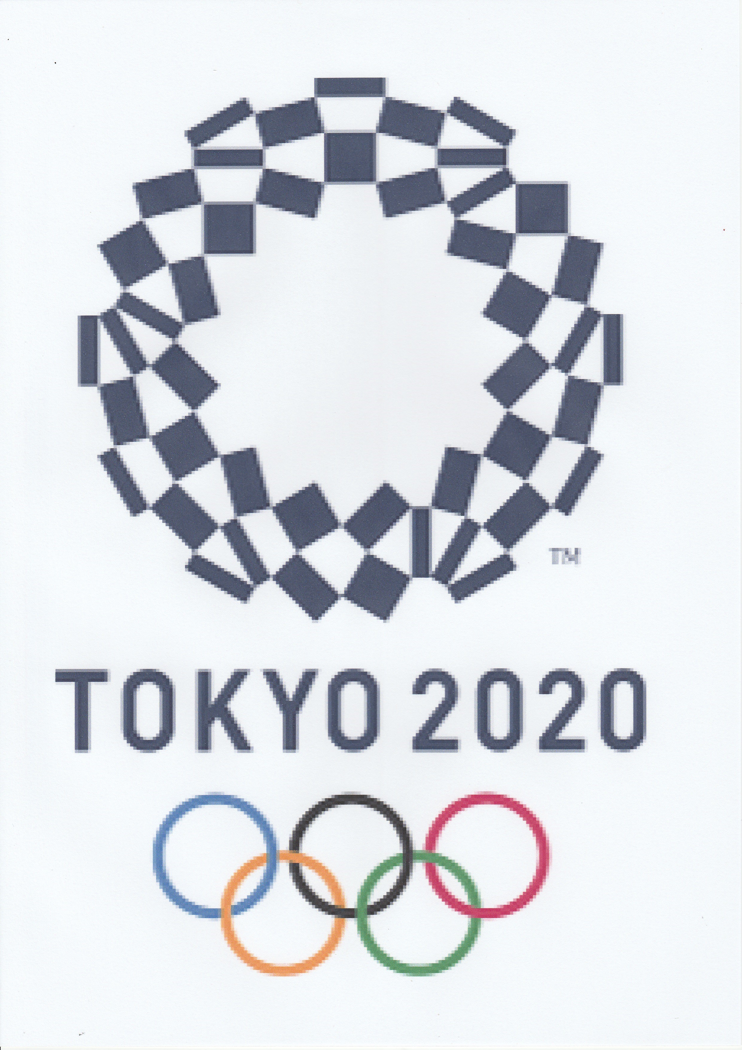
The logo, designed by artist Asao Tokola, is said to be based upon the chequered pattern in traditional Japanese indigo blue known as “ichimatsu moyo” from the Edo period (1603-1867).
The Paralympic logo has similar influences and I will look at that in a later post. Asao Tokolo says that both emblems are made up of 45 rectangles of three different shapes pieced together.
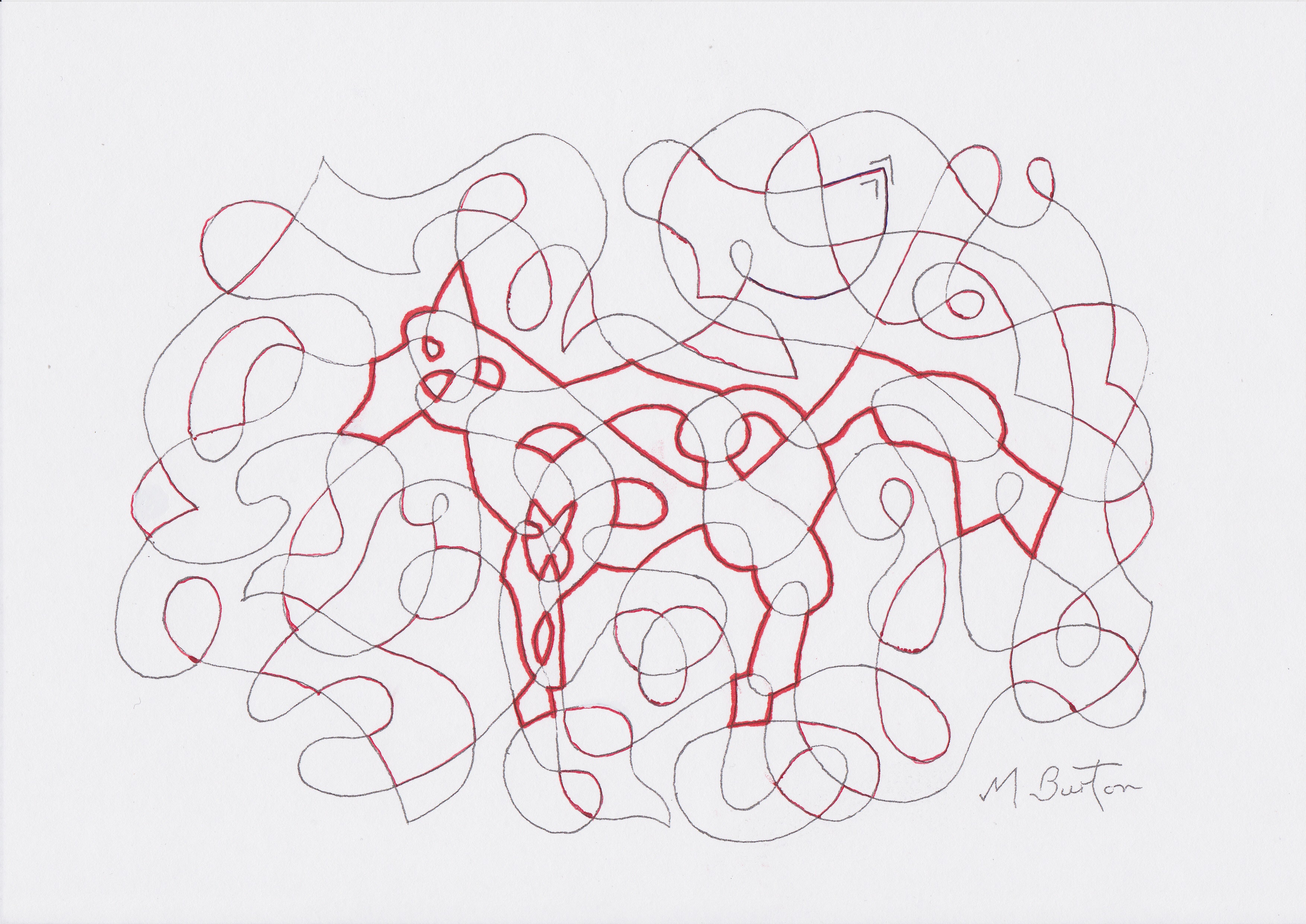
I traced the outlines following individual continuous line paths and found that there were four continuous lines within the Olympic emblem.

It was a delightful surprise to find three fish depicted by my three minor continuous lines. They appeared to be Koi, or Amur Carp, which feature in many traditional Japanese illustrations. According to Wikipedia “In Japan, the Koi is a symbol of luck, prosperity, and good fortune, and also perseverance in the face of adversity”.

What puzzles me is that the fish appear when I apply my continuous lines and yet I can find no mention, anywhere, that they have been built into the Japan Olympic logo deliberately as part of the design. It appears to be too much of a co-incidence for the artist not to have created the fish, or known about them.
But I have also to accept that it was a bit of a stretch for two Leeds athletes to win gold medals, in different sports, within minutes of each other a couple of days ago (Tom Pidcock and Matty Lee).
I have followed the video of an interview with Asao Tokolo, where he goes into considerable detail about how his emblem came into being (click on the grey sound balloon icon within the site) –
Tokyo 2020; Emblem designer Asao Tokolo talks about the design process (Video by Tokyo 2020)
Also he explains how he drew the posters using a compass and a set square to show the traces of the original drawing of the emblems –
I could find no mention of continuous lines being involved or of any embedded subjects, such as fish.
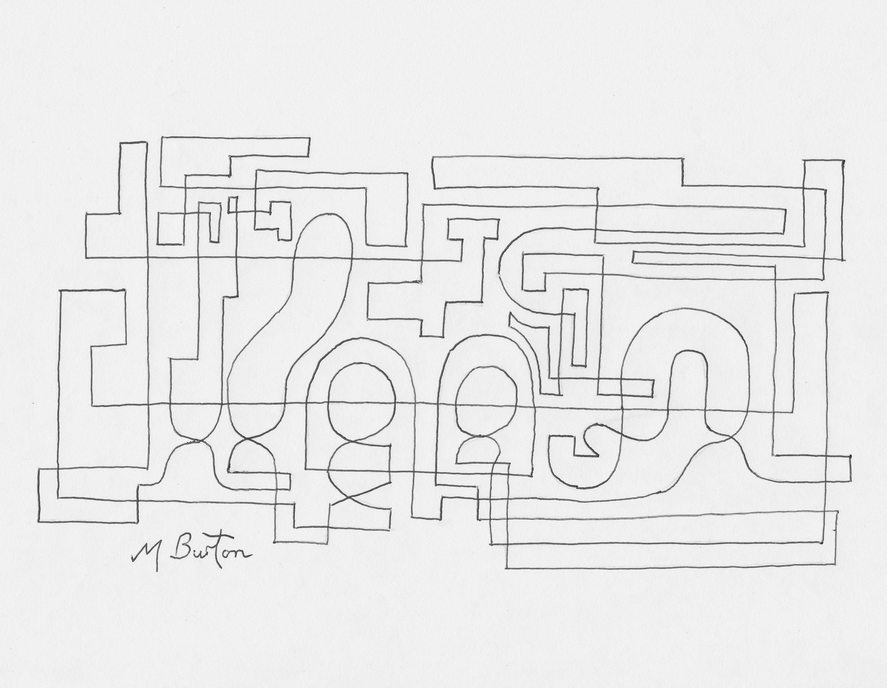
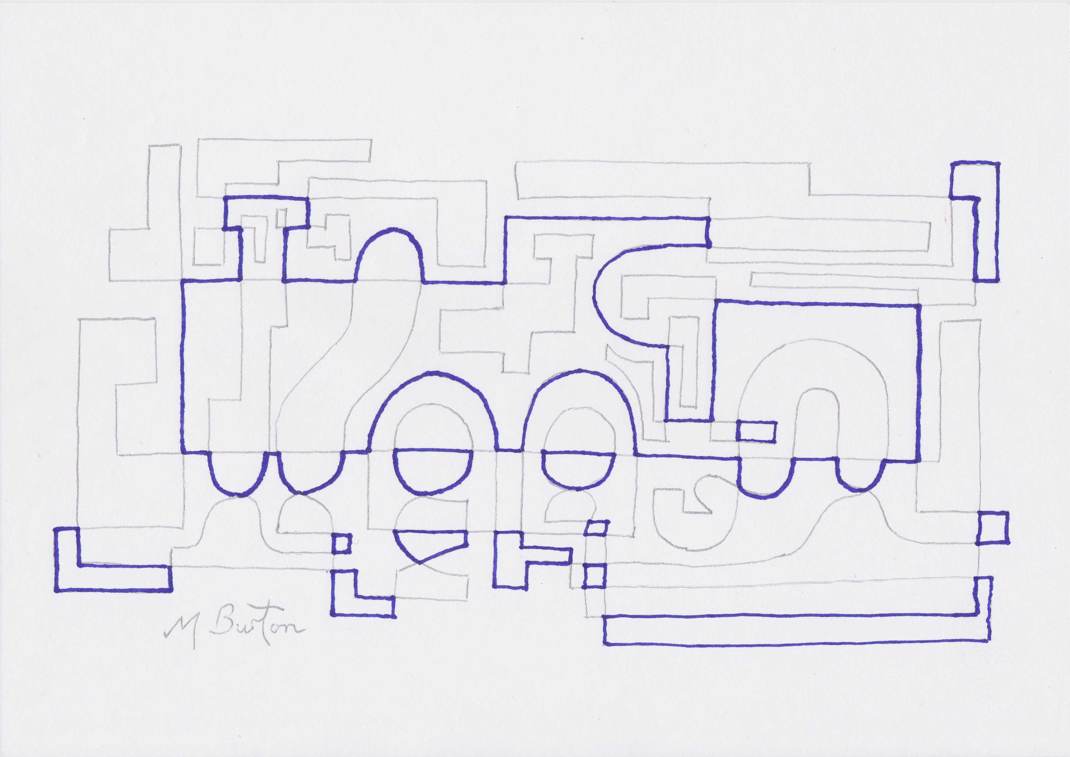
I have designed single continuous lines which look pretty abstract at first glance, but when my Alternate Overdraw method is applied a dog appears in one and a steam locomotive in another. See my post 18 October 2014 “Continuous Line Drawing Alternate Overdraw Embedded Image”.
However, it must be far more difficult to align the three sorts of rectangles in the Olympic Logo so that they form Asao Tokolo’s sphere, which underlies the logo, and also produce the fish.
I intend to contact the artist after I have published to post for his reaction to my thoughts. I will also tell him how amazing his various designs are, including the 1800 drones which hovered over the stadium at the Opening Ceremony morphing into various images, including the logo with more rectangles filling in the centre. I have found continuous lines in that as well, which I will cover in the next post along with other associated designs.
My thoughts were clarified when I examined the other designs, also including the Paralympic emblem and the plate, which I will illustrate in the next post. The filled in logo had three minor continuous lines, the Paralympic two and the Plate one. These minor continuous lines were interesting but none of them were figurative. I feel that, with my knowledge of continuous lines, the fish images were a one off occurrence and not designed.
Maybe the fish are a sign that the decision to go ahead with the Olympics was a good one.
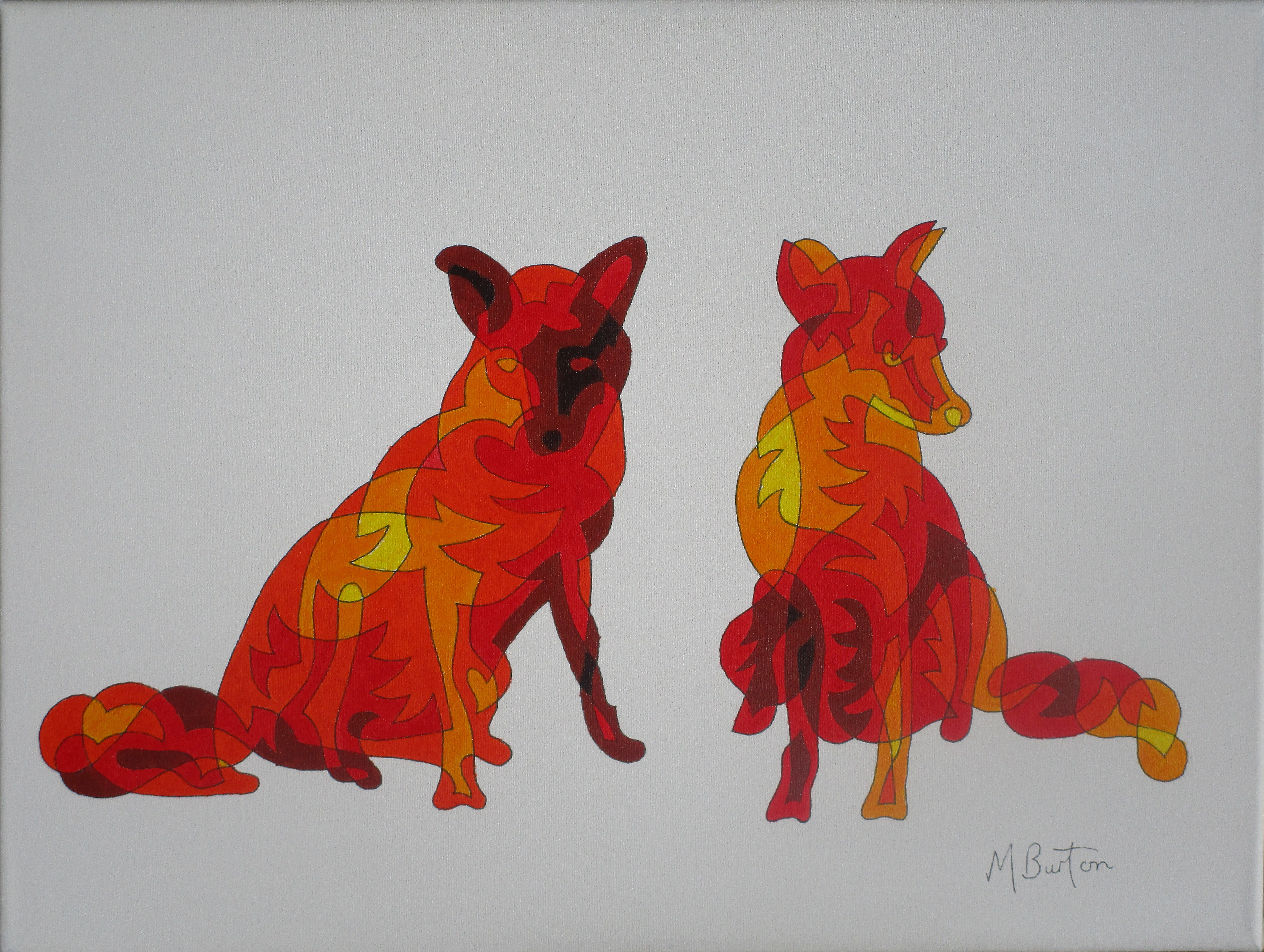
Meanwhile, I decided to apply some of my colour ideas to the fish and painted the picture at the top of this post. I have used as many of the colours appearing in the Olympic rings as I could for two of the fish, ie. the Yellow, Blue and Red primaries and where they overlap I get Green, as well as Orange (which is not a ring colour). The fifth colour, Black, I have used for the important thicker outlines of the fish. The top fish is not coloured in.
If you would like to have a go at drawing the continuous lines yourself, or encourage anyone else, I include a Starter Sheet where I mark start points for the Blue, Red and Black continuous lines for the three fish.

At each junction of lines you must cross over another line, even if it means a deviation. After you have completed the three Fish, all remaining lines are in one continuous line.