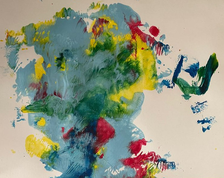
“That’s our Water on the Goldcoast”. Reaction by Terry when shown “Climate Change Down Under”, a continuous line drawing by Mick Burton.
Our friends Cathy and Terry, who live in Queensland, Australia, were over here recently. I showed them a photo of my painting “Climate Change Down Under” which I featured in a recent post Climate Change Hits Australia, continuous line drawing.
I show it again below. Terry immediately said “That’s our Water!”.
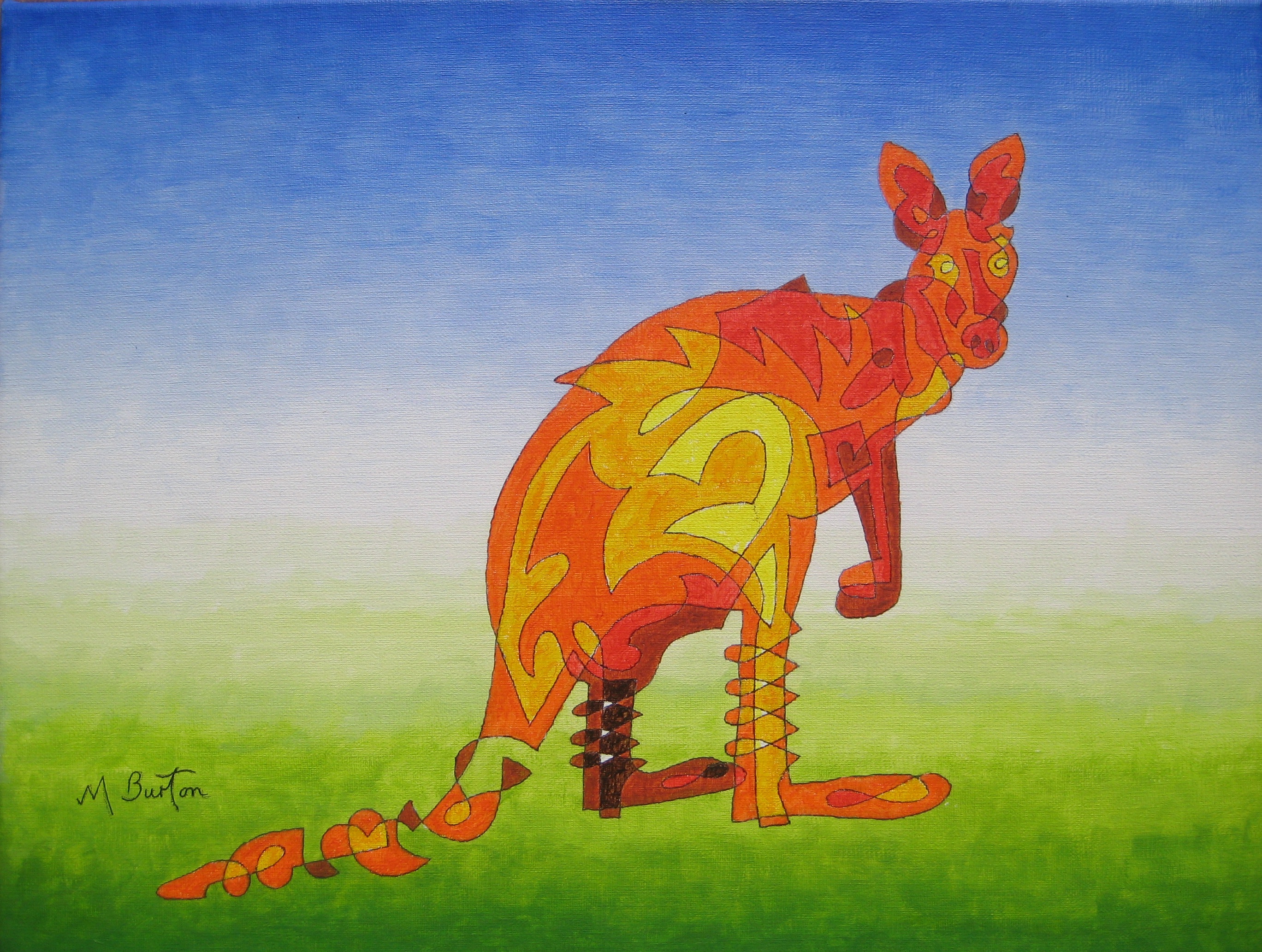
Climate Change hits Australia. Continuous line drawing. Mick Burton.
When I painted it I simply wanted to include a shape depicting Water in blue, in contrast to the Fire in red and the Sunshine in yellow on the land behind. We knew that Cathy and Terry lived on the Gold Coast and overlooked some moorings, but I did not realise that their waterways were so similar to my painting.
Here is a broader view of their wonderful part of the Gold Coast, which is near Brisbane in Queensland. Their “water” is at the bottom of the map.
Runaway Bay, on the Gold Coast, showing Cathy and Terry’s “water” at the bottom. Mick Burton, continuous line artist.
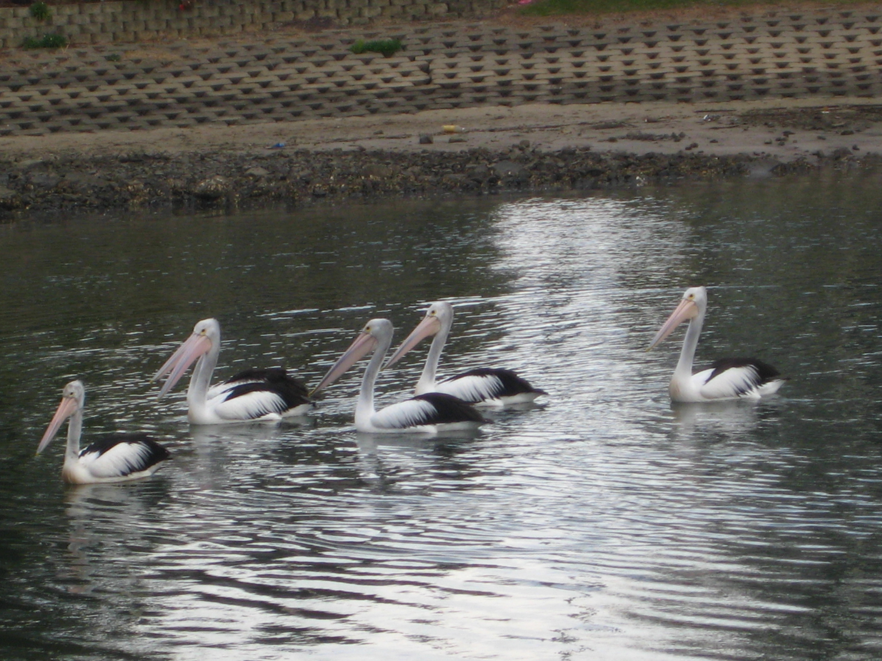
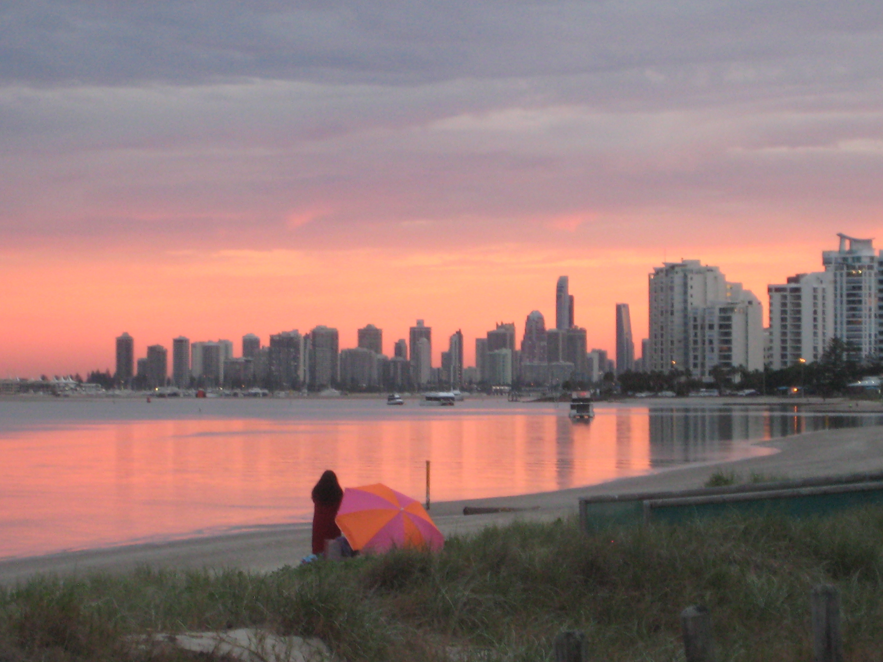
When Joan and I visited Cathy and Terry in May 2013, they lived inland as I mentioned in the post of October 2022. Cathy dropped us off in the Gold Coast for the day and here are a few photos.
Gold Coast, Queensland. May 2013. Mick Burton, continuous line artist.
Pelicans near the beach, Gold Coast, Queensland. May 2013. Mick Burton, continuous line artist.
Sunset on the Gold Coast, Queensland. May 2013 at about 4.30pm. Mick Burton, continuous line artist.
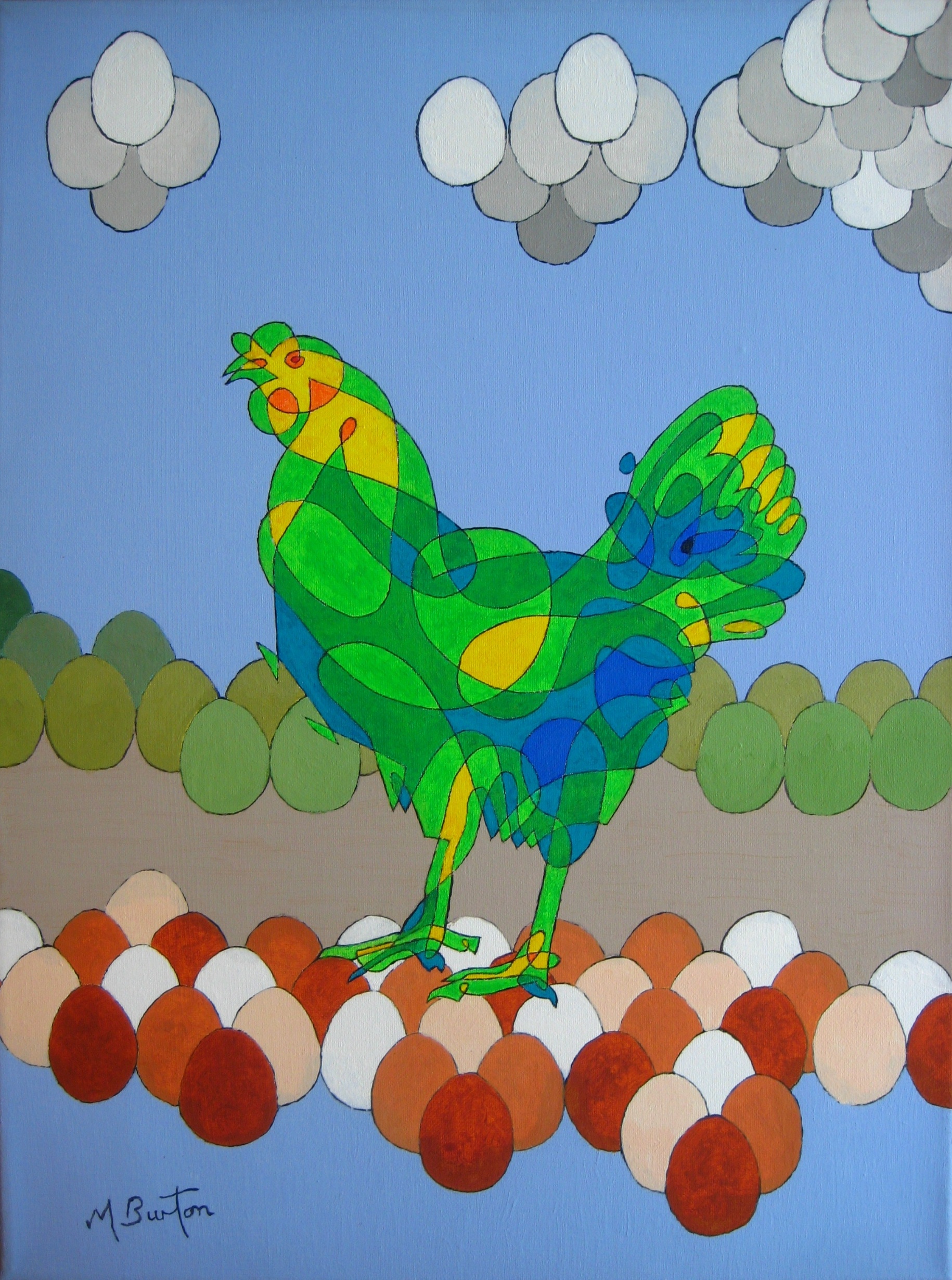
Continuous line Hen by Logan Clarke. Mick Burton post.
Logan contacted me a couple of months ago, saying that he was in Year 7 at a school in Derbyshire and that his Art Teacher had asked his class to complete a homework project based upon my art.
He liked the Rhino that I had featured recently (which was done by a member of Pateley Bridge Art club during a workshop) and my Hen with eggs, which I show below. He asked for some advice on how I do my continuous line drawings.
Harriet’s Busy day. Single continuous line drawing with colour sequence. Background based on eggs. Mick Burton, 2012.
I sent Logan a short write up on my approach to Continuous Line Drawing and he later sent me his marvellous coloured drawing of his own hen invention, shown at the top of this post. He has used a range of colours which go well together and the yellows are placed in a very balanced way. He shows the vibrancy and character of the hen.
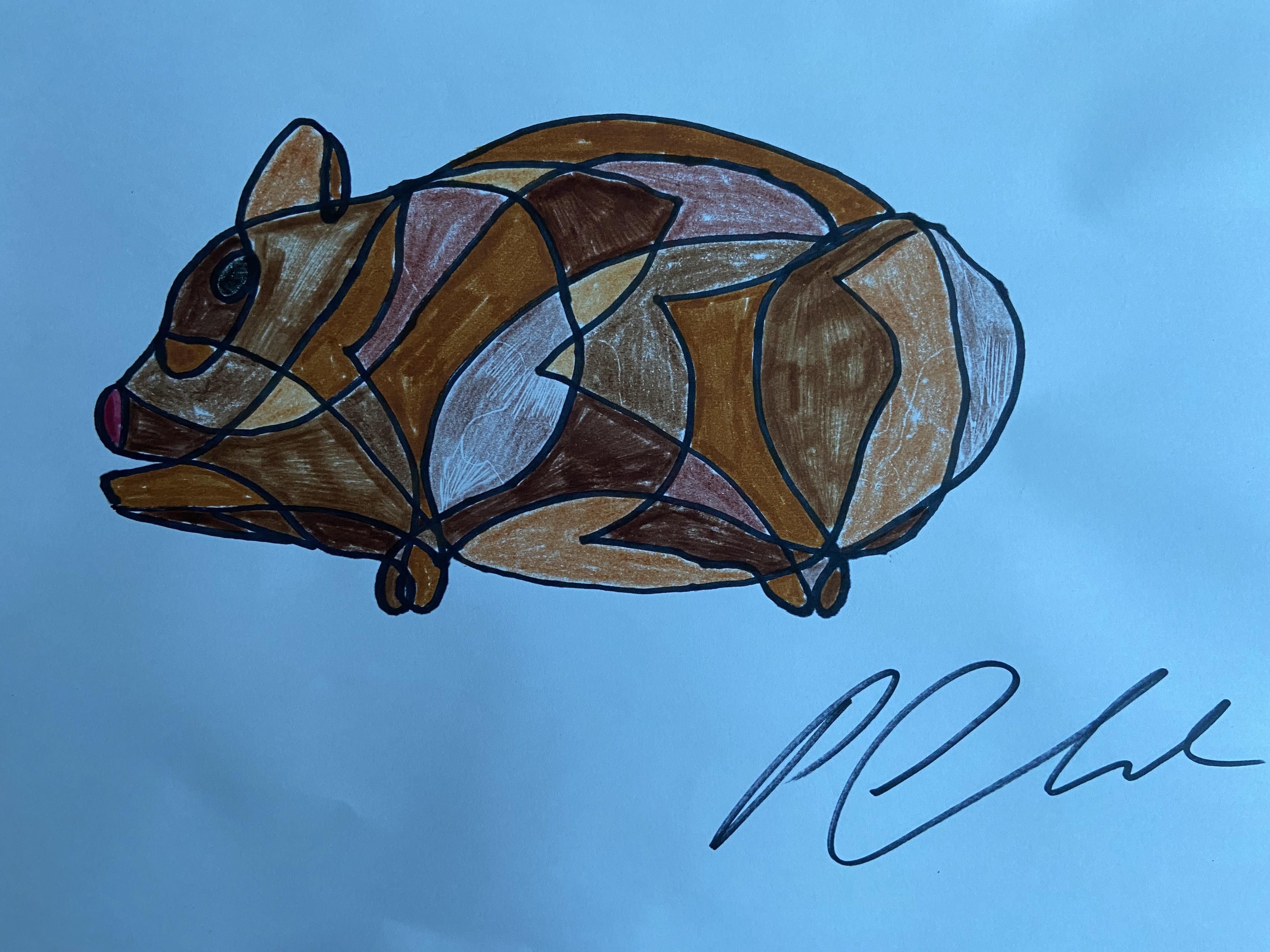
Logan’s Dad Paul also had a go at a continuous line Guinea Pig which I show below.
Logan’s Dad Paul Clarke’s continuous line guinea pig. Mick Burton post.
This is an excellent compact drawing with solid balanced colours. I can imaging this animal bulldozing its way through the straw.
Logan had said that he was due to visit York on holiday and he was looking forward to doing a drawing of York Minster. I said that I would like to see the result. Here it is.
York Minster, drawing by Logan Clarke. Mick Burton post.
I mentioned to Logan that I have an ancestor, Thomas Mace a 17th century composer, who said in his book on music that he was at a service in the Minster during the Civil War when York was under siege by Cromwell’s soldiers. He described how a small missile from a gun smashed through a high window and bounced off several pillars inside before hitting the floor. Made me think of a pin ball machine.
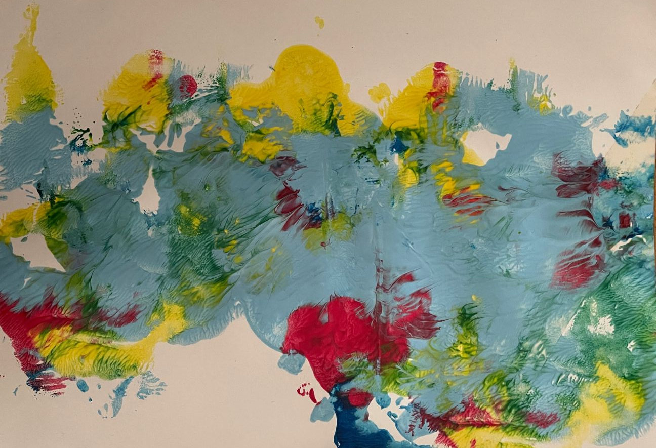
Climate Change hits Australia. Continuous line drawing. Mick Burton.
I have been looking at using the Primary Colours in a way which uses the colour mix when they overlap. I wanted to produce a result as effective as that achieved in my “Knight’s Tour Fragments” abstract shown below.
“Knight’s Tour Fragments”, acrylic on canvas. Exhibited at Harrogate and Nidderdale Art Club Exhibition in November 2016. Mick Burton, continuous line artist.
Here I produced a similar effect to overlapping pieces of coloured glass.
This time I decided to give each Primary Colour a distinctive shape which seemed to reflect the nature of the colour itself. Red often represents Fire and so I decided to use straight lines and pointed angles to contain it. Blue is a quieter colour often representing water and so I decided upon curves and flowing fingers to contain it. Yellow can represent the sun and I thought of the outline of Australia, which includes the “sunshine state” of Queensland.
Joan and myself visited some friends of hers in Queensland in 2013. They lived inland from Brisbane in a large wooden house that they built, which had a couple of wallabies resident in the garden. They moved to live on the Gold Coast a few years ago, but heard from old neighbours in early 2020 that a bush fire had nearly destroyed their old house. The street had been evacuated and the fire was apparently heading for the house but veered off in another direction just in time. The increased number of fires are attributed to Global Warming.
Earlier this month we saw on the news that floods in Sydney were amongst the worst since records began in the 1850’s.
With all these things coming together, I decided upon Primary Colours and Australia as part of a Continuous Line workshop I did a couple of weeks ago at Harrogate and Nidderdale Art Club.
For the picture at the top of this post, I superimposed the straight line Red fire line and the curvy Blue water line on top of the sunny Yellow Australia. This produced semi-primes Orange, Green and Violet areas and where all three Primes overlapped we have a sort of muddy Brown.
I like to think that the outline of a subject can be used to direct continuous lines into the interior which create an image representing the subject. After completing a single continuous line over a map of Australia I realised that there was something like a kangaroo in there which I have marked in red. Also, if you push things a little, there may be a Black Swan over Western Australia.
Kangaroo and maybe Black Swan images from single continuous line of Australia. Mick Burton.
The friends we visited have my Wallaby painting in their house on the Gold Coast.
Wallaby, or Kangaroo. Single continuous line drawing and colour sequence. Massive distance background added. Mick Burton, 2013.
Other Primary Colour things we did I will cover in a later post.
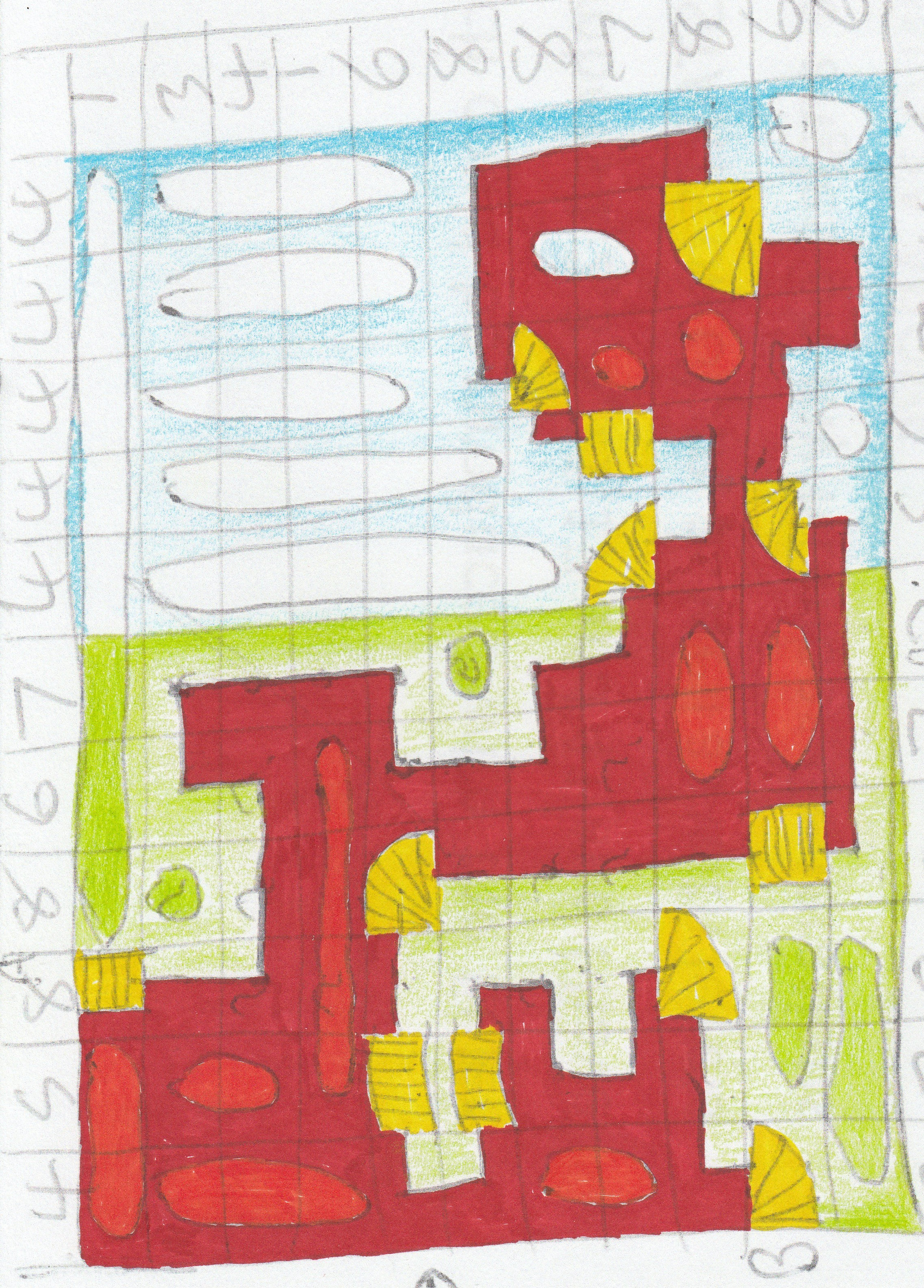
When I try to solve a Train Tracks Puzzle, I draw out the grid freehand and copy in the cross references of number of tracks in vertical or horizontal rows as well as the given pieces of track. A big part of the process is marking the squares, which will not have track pieces, with a circle or cloud shape. I draw in the track I have decided upon with a line between given pieces of track.
Most people will complete the puzzle on their phone or laptop from start to finish, but I just like drawing things, rather than hitting wrong buttons on keypads most of the time. Here is my initial drawing.
Initial drawing of Train Tracks Puzzle 1.5.2022. Mick Burton, continuous line artist.
I coloured all “given pieces of track” yellow and the interior of the Alien red in Sharpie pen and did lighter background with coloured pencils, leaving the cloud shapes white.
Here is another Alien from two days later.
Green Alien based upon Train Tracks Puzzle. Large 3.5.2022 Puzzle Madness. Mick Burton, continuous line artist.
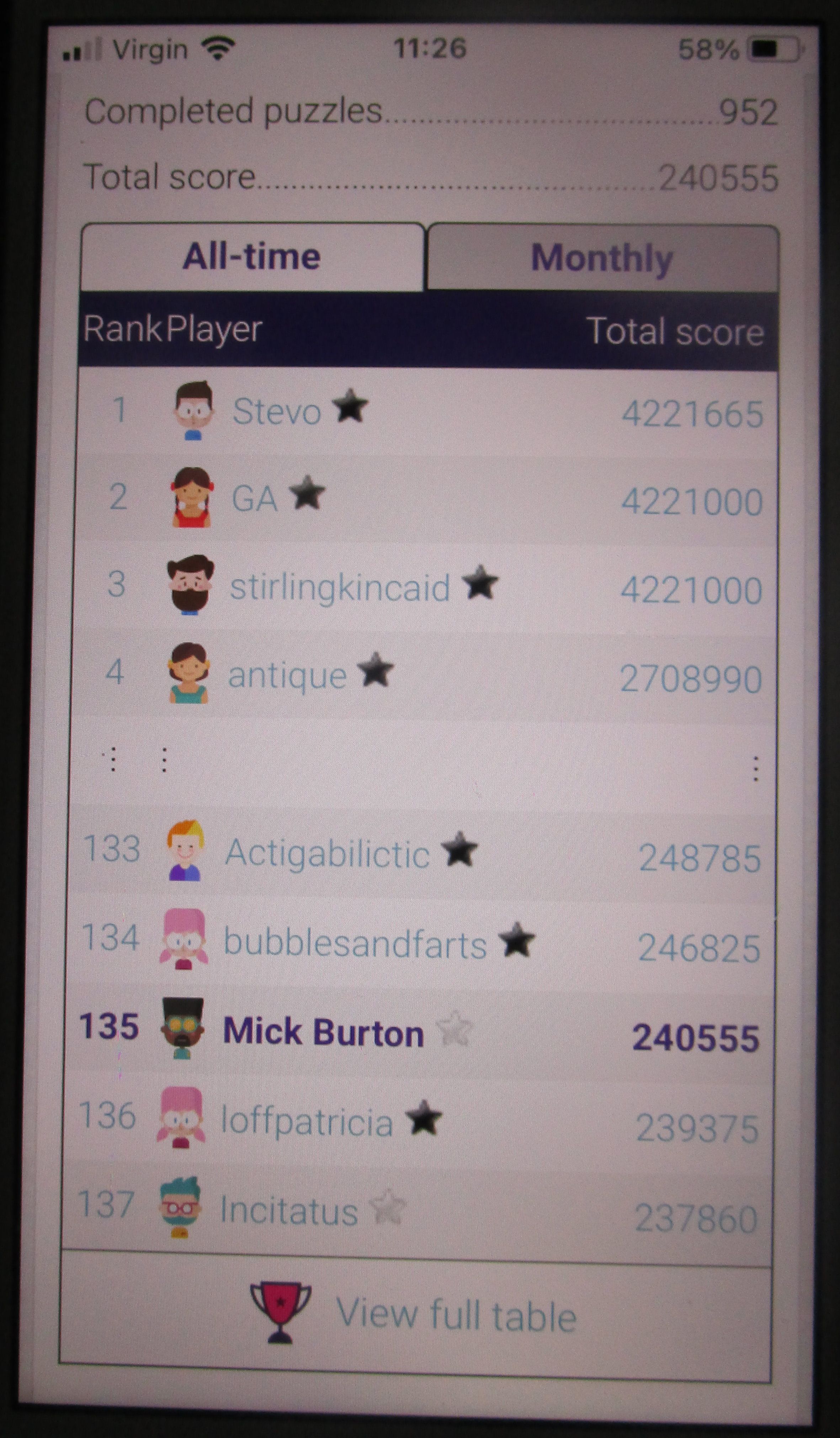
I mentioned in my post of 24.12.2020 that I was at position 272 out of the 863 people listed. Also that I had scored 17.925 points compared to the top rated Stirlingkincaid with 2,766,965. This was nearly twice the points of anyone else and I wondered if he ever slept.
I got to about position 130 and for a time just tried to keep treading water at that level. The number of participants had more than doubled since I started. Here is the summary a few months ago, at about the time I ceased to do the puzzles. You can find the Train Tracks puzzles on https://puzzlemadness.co.uk .
All time Train Tracks table on Puzzle Madness in June 2022. Top three all over 4 million points and Mick Burton on 240 thousand.
GA had drawn level with Stirlingkincaid on 4,221,000 but both trailed Stevo by 665. Fourth place Antique was only on 2,708,990. Do any of them ever sleep?
I have kept quite a lot of my initial drawings and may do some more Aliens.
I drew Winding Number Man, which involved looping around in the same direction from start to finish.
Winding Number Man. Continuous line with alternate overdraw. Mick Burton.
If I had done this in a concentrated area, like the close spiral I used in Petrol Polluted Puddle, I would have had a long single series of overlapping colours. However, as I progressed around the head, body, legs and arms of the man I avoided too many overlaps. As I gained new overlaps, previous ones fell away.
The longest sequence of colours is six, whereas with PPP the real sequence is 19. I could not cope with one sequence of colours that long, with only slight changes between each one, so I used a repeat rainbow sequence which provided the puddle effect I wanted.
The shorter single sequence of colours on the Winding Line Man gives him the form and density I required.
All along I had in mind something similar to the Michelin Man who advertised the tyres. Here is a recent representation.
Michelin Man logo. Creative Review.
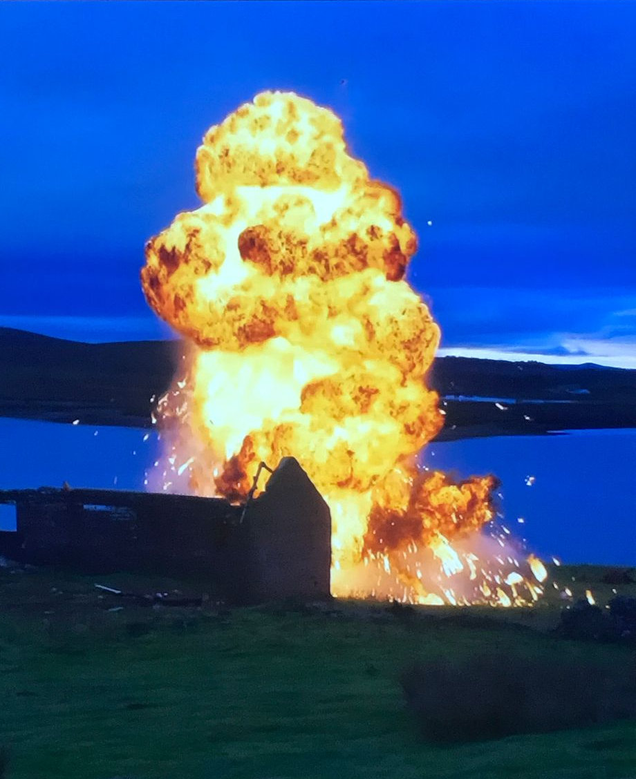
Strangely, I was remined to get on with this blog when watching the new Shetland TV series, where Detective Sergeant “Tosh” McIntosh was trapped inside a caravan which was about to explode. I paused the TV in the middle of the explosion and the freeze frame flame looked a bit like the Michelin Man.
Shetland explosion looks like the Michelin Man. End of Episode 3, Series 7.
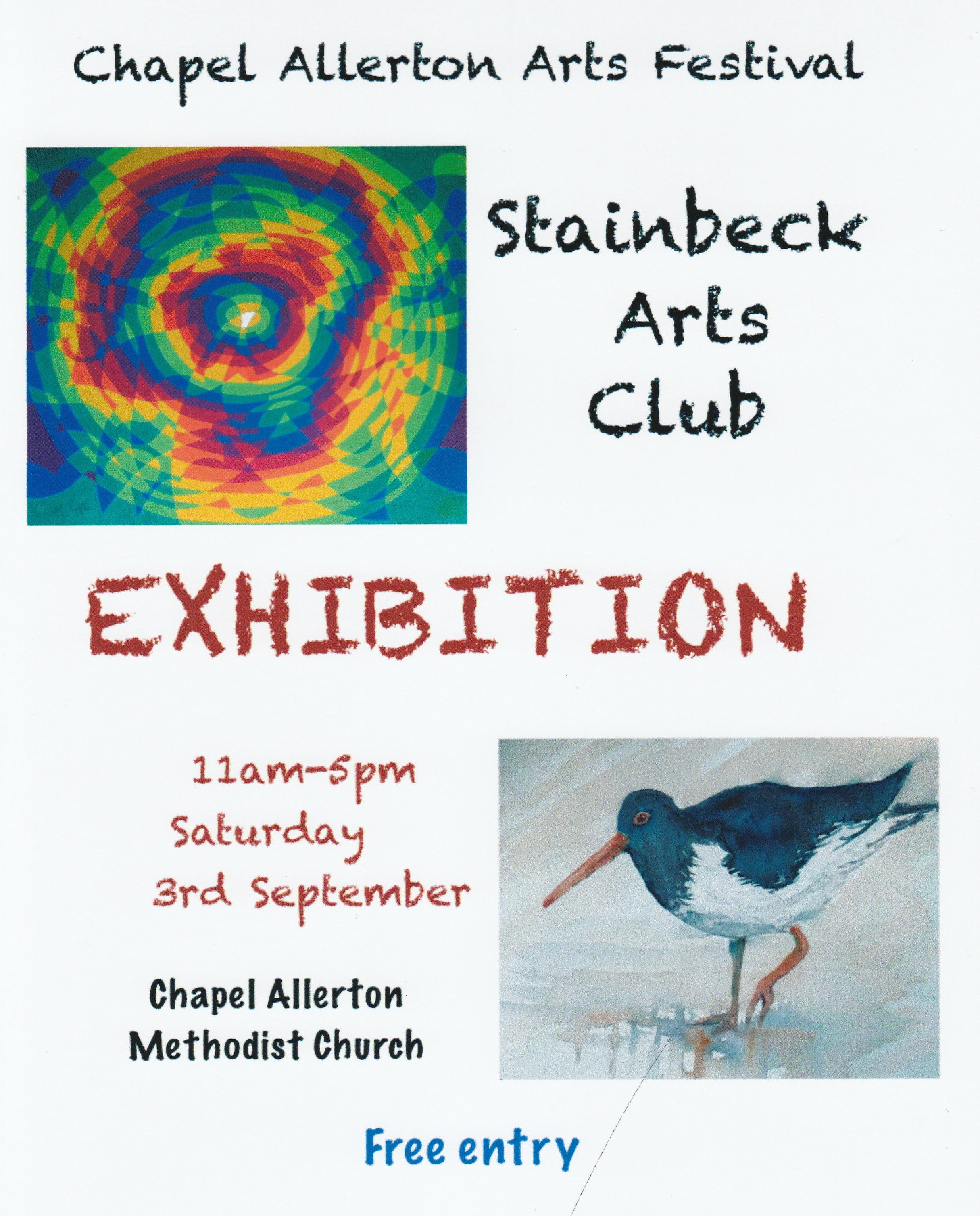
Stainbeck Arts Club Annual Exhibition at Chapel Allerton Arts Festival.
The Stainbeck Arts Club has its first Annual Exhibition following the end of Covid on Saturday 3rd September 2022. As usual it is in the Chapel Allerton Methodist Church and alongside the activities of the Chapel Allerton Arts Festival. Entry is free and a fine range of paintings and cards will be on view.
If you are interested in joining the club, our meetings are on the second and fourth Tuesdays each month from 2pm to 4pm. Just ask for details at the exhibition. You can come along to see what we doing before deciding to join.
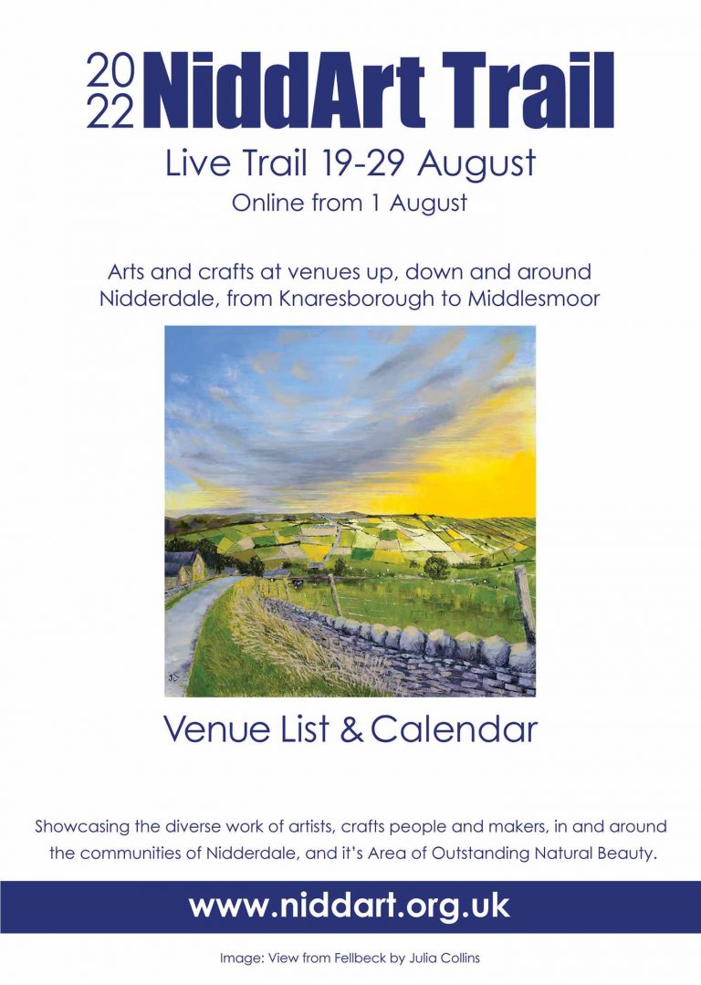
I was invited to take part in the Online section of the Nidd Art Trail 2022.
As I am not involved in any of the venues along the art trail, I have included several pictures which have direct association with various places in Yorkshire such as Ripon, Ripley, Knaresborough, Kilburn, Otley and my home in Gledhow Valley in Leeds.
The Website is very impressive. Go into “The artists, craftspeople and makers …” tab and there are over 60 feature works of art or venues. Just click on any one to see more individual pictures etc and information about the artists.
There is also illustrated information about the venues along the art trail.
Fathers’ Day card, from my daughter Kate, painted by my grandson Lucas. Mick Burton, continuous line artist.
This action painting, by my grandson Lucas, reminded me of a fast rushing stream.
My daughter Kate is a professional artist and film maker (see my post of 2 February 2016 – “BB” by Kate Burton, Glasgow film maker, at London Short Film Festival),
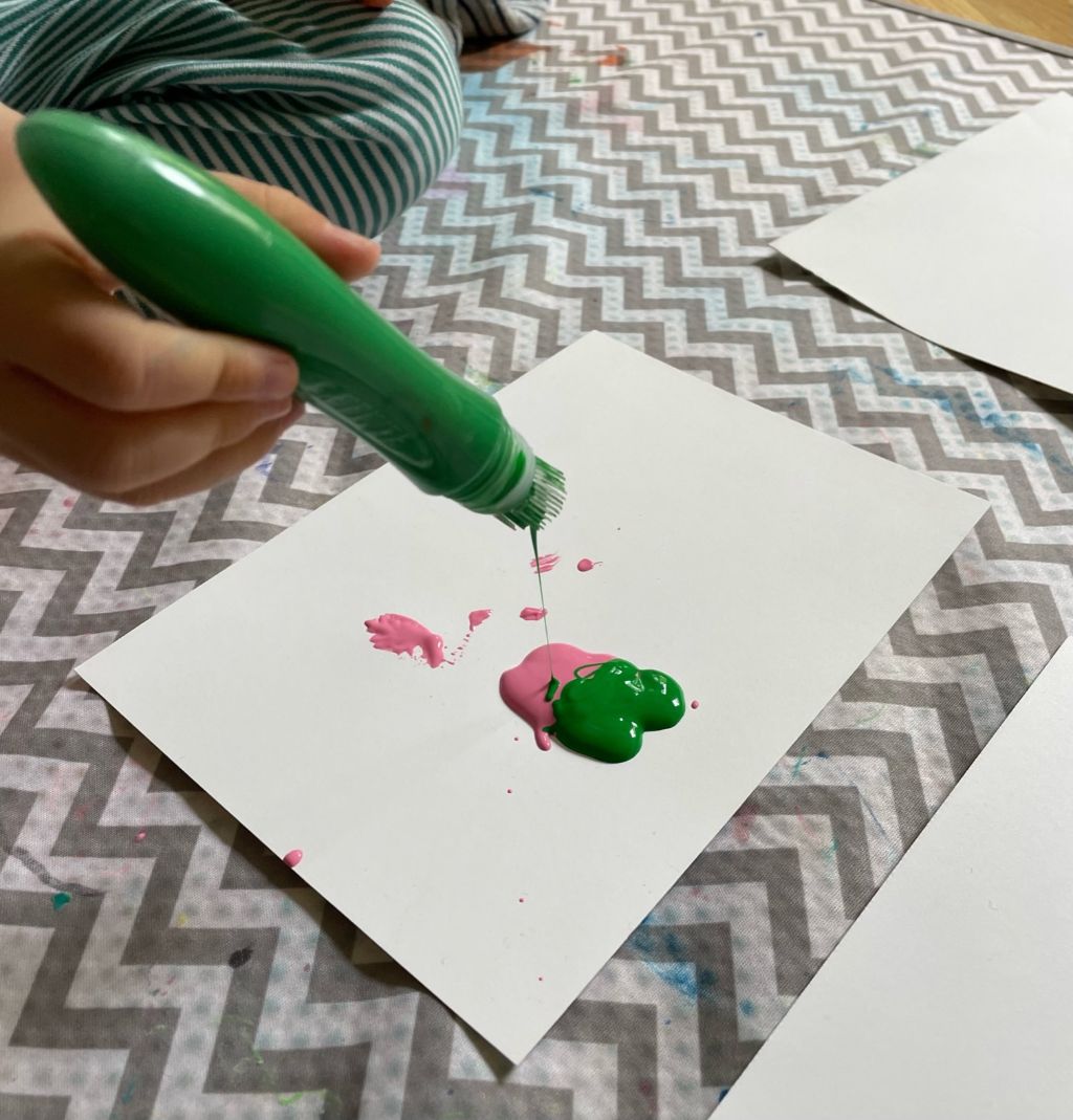
Three year old Lucas receives plenty of encouragement to make pictures.
Lucas also squeezes paint tubes directly onto a piece of card to create mixes of paint, before Kate provides another piece of card to squash the paint. There is a sort of ink blot “butterfly” copy effect.
Lucas squeezes paint directly from the tube. Mick Burton, continuous line artist.
Here are some results, along with “Grandad” type observations.
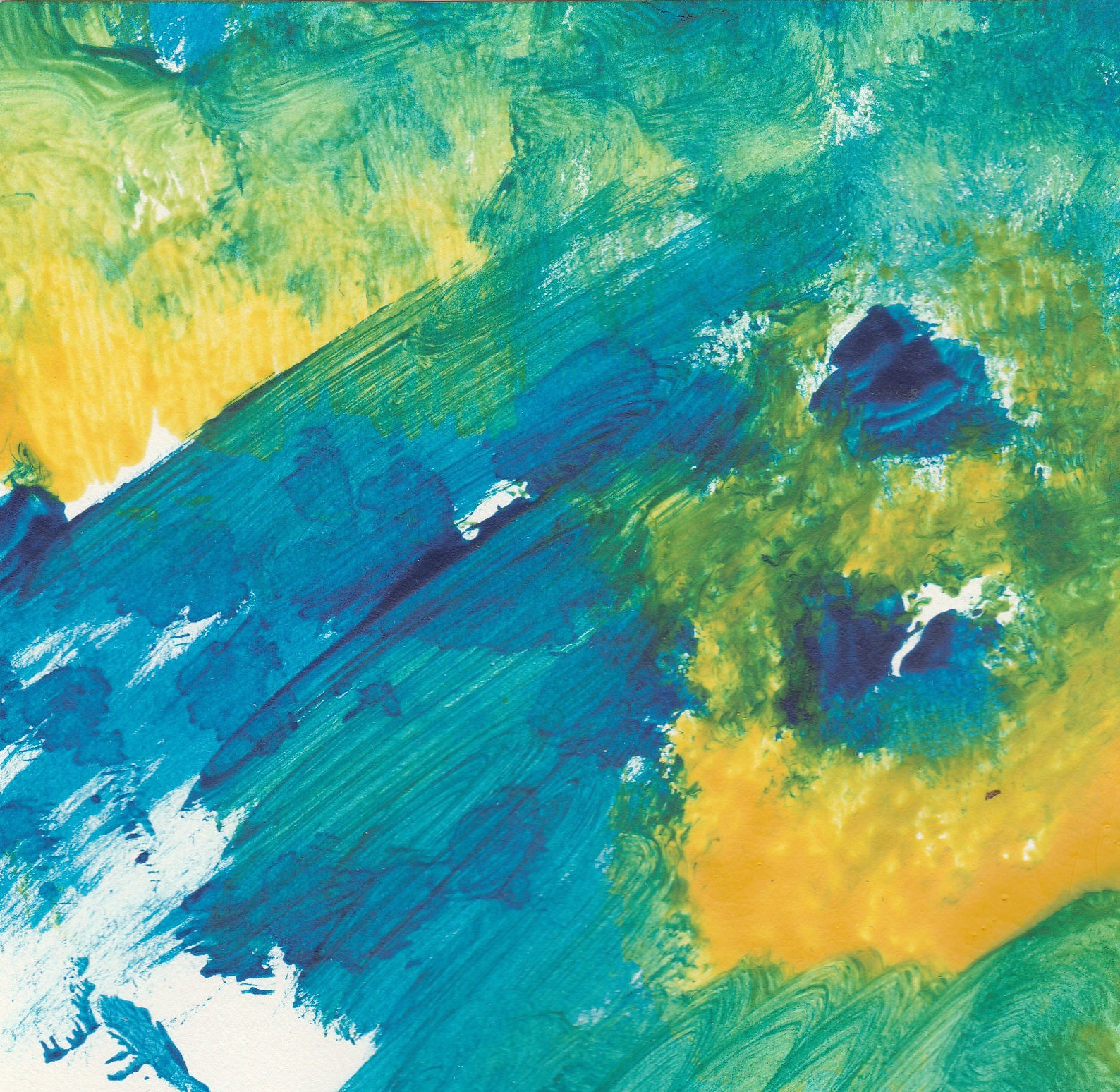
Lucas watery landscape. Mick Burton, continuous line artist.
This result made me think of a sort of Chinese or Japanese landscape painting. Here is a modern version for comparison.
Autumn Mountains at Dawn, by Zhang Daqian. En.wahooart.com.
The next picture has the appearance of a flying elephant, and I have done a few continuous line elephants in my time.
Lucas’s flying elephant. Mick Burton, continuous line artist.
Lucas’s flying elephant. Naturally, he has a squash copy flying the other way. See below Dumbo, the most famous flying elephant.
Dumbo the Elephant, from Tim Burton’s remake of Dumbo Takes Flight.
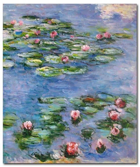
Another Lucas watery image reminded me of a Monet.
Lucas – garden pond squash painting. Mick Burton, continuous line artist.
Here is one of Monet’s many paintings of water lilies.
Water Lilies Giverny – by Claude Monet.
One day I may tell you about a picture Kate painted when she was four.
Pateley Bridge Art Club member’s single continuous line Rhino with internal pattern.
I was at Pateley Bridge Art Club earlier this month with a Demonstration and Workshop for the members. They have covered the evening in their News Blog with a report by Charles Mellor, which included 16 examples of members’ pictures. You can find the report at > https://www.pateleybridgeartclub.org .
I include here an additional three pictures by members which illustrate how you can devise an internal pattern which represents aspects of the subject. Members could base their initial attempt at a continuous line, or lines, on a subject of their choosing or one or more of several faint outlines provided by myself.
I demonstrated how the basic ongoing line can involve curves, loops, angles, etc. taking in parts of the outline itself and involving where possible a novel pattern for that subject. At the same time there is a need to leave spaces for the line to return to the start. I said that members were free to use rubbers to correct their drawings or have more than one continuous line in their picture to get used to the process.
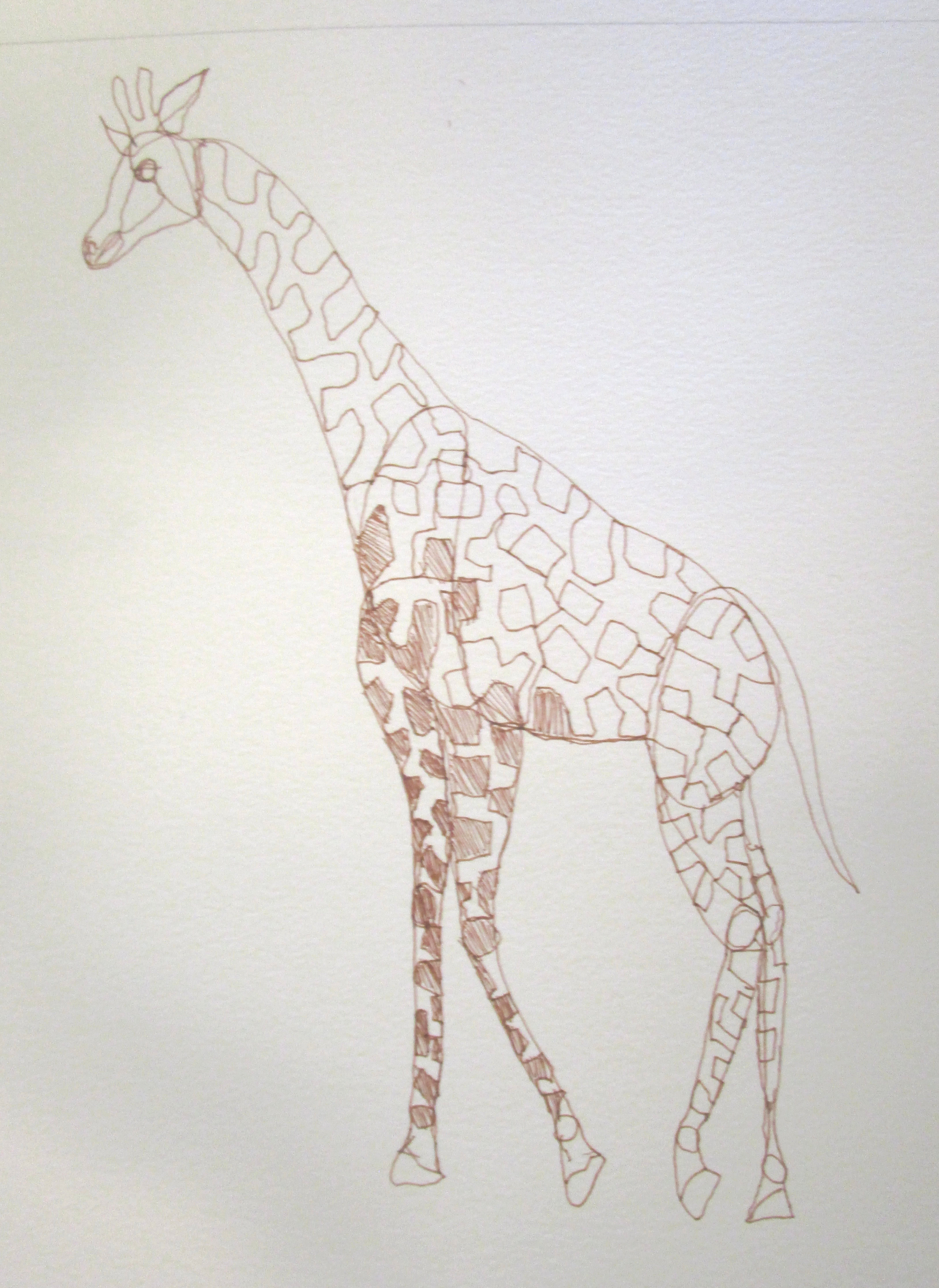
One member drew a Giraffe which incorporated some of the distinctive inner pattern of that animal.
Giraffe by Pateley Bridge Art Club member, showing inner pattern.
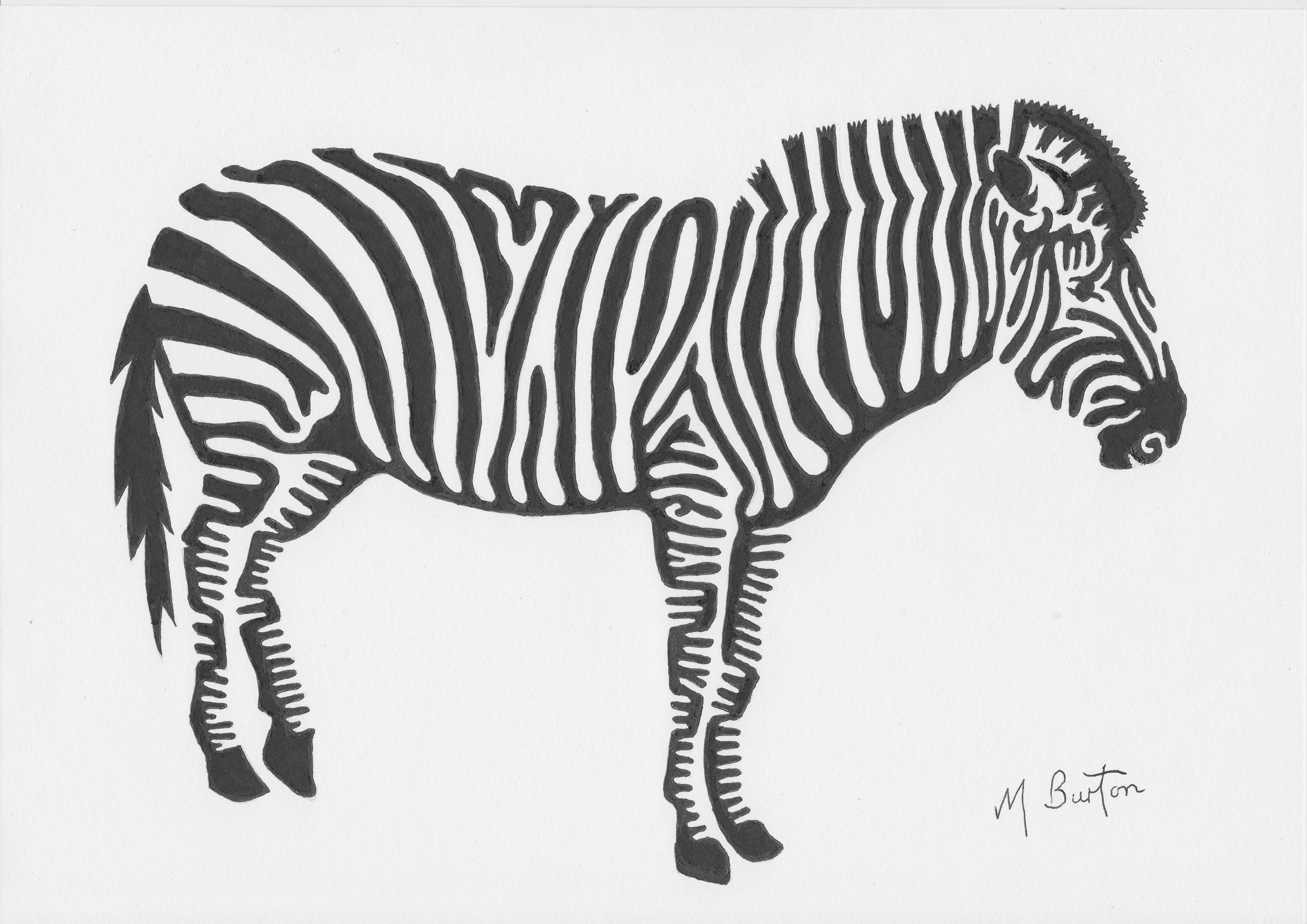
My third example is a Zebra where the member has included the famous stripes.
Head of a Zebra, by Pateley Bridge Art Club member.
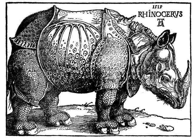
The Rhinoceros above has a good inner pattern reflecting the armour plating appearance of the animal. It reminds me of the woodcut by Albrecht Durer, who was amongst the first artists to portray this animal.
Rhinoceros woodcut by Albrecht Durer in 1515.
And that’s not all. The Pateley Bridge member’s Rhino at the top of this post has a clear single continuous line and includes two specific features I have used in the past which appear in pictures which I displayed on the evening but may, or may not, have have influenced the drawing of this Rhino –
a. The Rhino’s left eye is depicted by a gap in the outline, similar to my Panther’s right eye below, where I show only the pupil of the right eye.
I have requested that the Pateley Bridge member, who did the Rhino, copies the line and then applies alternate shading to highlight the “inside outside” effect. If not I may have to do it myself.
Picasso was certainly aware of this “inside outside” situation. At my Demonstrations I pass around Picasso’s book “One-liners” which has 50 pictures. Most have the line starting at one end and then stopping on completion elsewhere, but there are several which are single continuous lines. The last two pen drawings in the book are as follows.
Picasso “Studies for Mercury”. Picasso’s One Liners. Artisan, 1997.
On the left, the head, arms, body and legs are all inside the single continuous line. At first glance it is the same on the right, but in fact there is no “inside”.
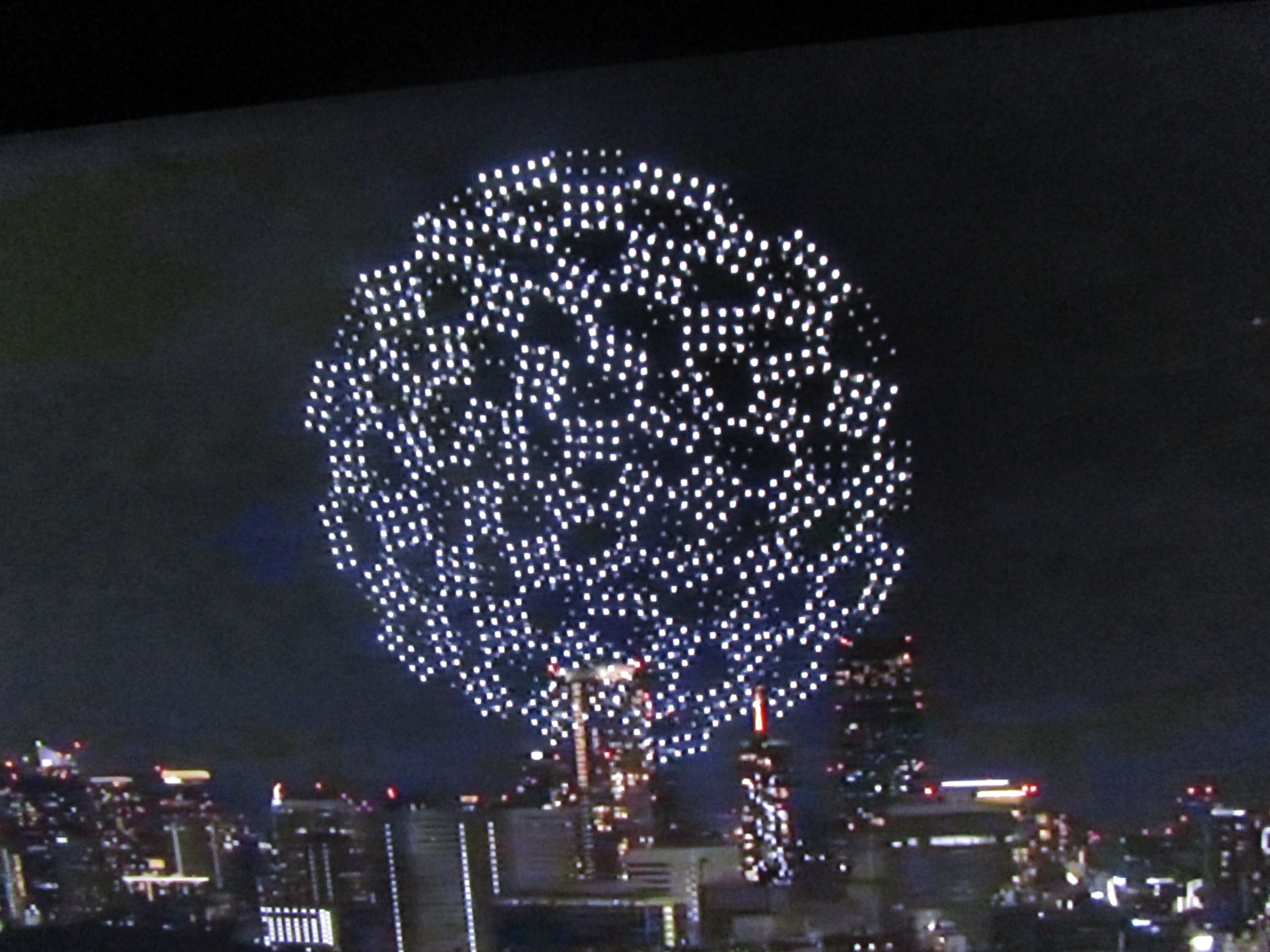
Continuous lines running around the circuit within the Tokyo 2020 Olympic logo drone display at the Opening Ceremony. Mick Burton, continuous line artist, Leeds.
Following my first post, which concentrated on the main Olympic logo of the Tokyo 2020 Olympics, and the three continuous line fish it contained, I now look at related versions of the logo designed by Asao Tokolo and apply my continuous line theories to them.
The Tokyo Olympics 2021 Opening Ceremony culminated in an amazing night time display by 1800 co-ordinated drones. It started with the Olympic logo, designed by Asao Tokolo, outlined by the drones. They developed more rectangles filling in the logo’s centre as it turned into a globe. All continents gradually appeared upon the globe.
I took this photo on my television at a point where I thought that additional central rectangles more or less connected up in all directions. I could then add these to my previous drawings of Asao Tokolo’s main Olympic logo so that I could then apply my continuous lines to the new full set of connected rectangles.
As you can see from the picture at the top of the post, there are now three minor continuous lines and the rest of the lines from the rectangles make up one larger more complicated continuous line.
In contrast to the three fish following each other clockwise around the main logo (highlighted in my previous post), here we appear to have three foot shapes running clockwise within the logo circuit.
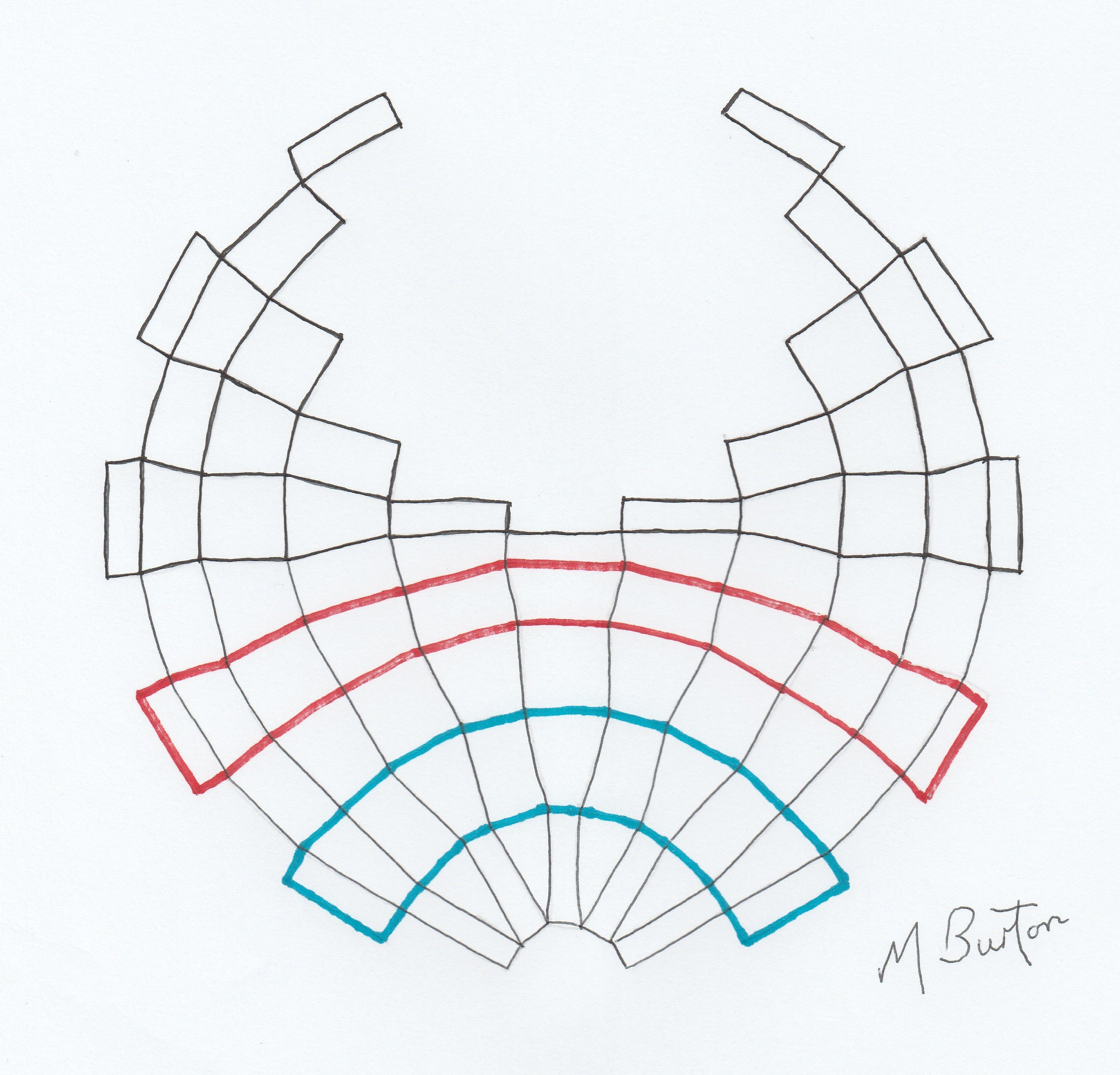
Now we will look at the other main logo, for the Paralympic Games Tokyo 2020.
Tokyo 2020 Paralympic Games logo (now 2021), designed by Asao Tokolo.
Once more I draw the outlines of all the rectangles and apply my continuous lines.
Continuous lines applied to the Tokyo 2020 Paralympic Games logo, which shows two minor continuous lines. Mick Burton, continuous line artist, Leeds.
This time, we have two minor continuous lines in Red and Blue, with the rest of the black lines being one continuous line.
There is a further example of a logo related design and that is the Tokyo Olympic Plate.
The Tokyo 2020 Olympic Plate, amongst other memento examples. Designed by Asao Tokolo.
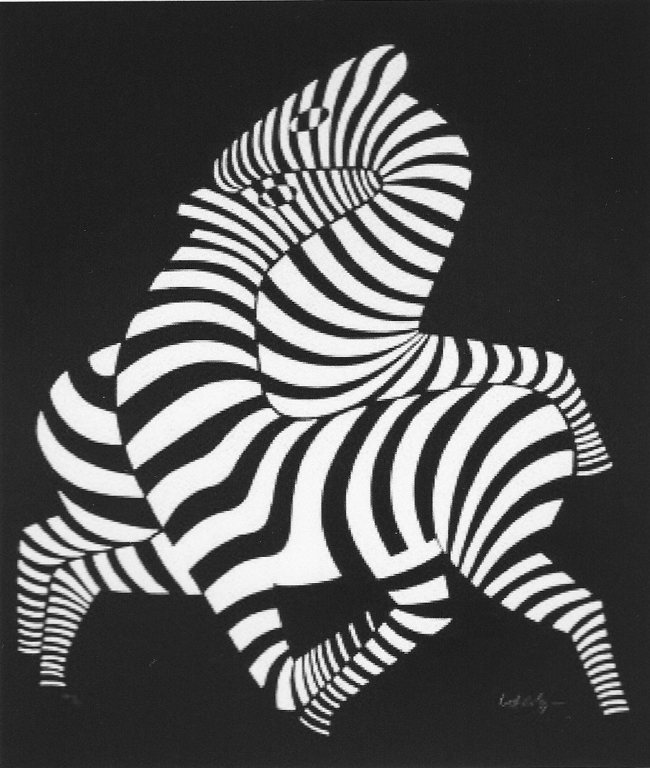
The Plate reminds me of a Zebra painting by Victor Vasarely, from an image he first created in 1937. The intertwined corridors of alternate colouring in both images produces a very similar optical effect. I am confident that Asao Tokolo is also an admirer, as Vasarely was selected to design the Emblem for the Munich Olympic Games of 1972.
Zebra by Victor Vasarely, from an image first created in 1937.
Joan has a collection of Olympic Plates and my step daughter Helen Frank swam for Great Britain in the 100 metres Breast Stroke at the Seoul 1988 Olympics.
Anyway, back to the Tokyo 2020 Plate, I have traced the rectangles making up the Plate design and applied my continuous lines as before.
Two continuous lines on rectangles in Tokyo 2020 Olympic Plate designed by Asao Tokolo. Mick Burton, continuous line artist, Leeds.
Here we have one minor continuous line in Red within the main continuous line in Black.
In summary, the three drawings in this post, as well as the main logo drawing in the previous post, each have a substantial main continuous line along with one, two or three minor continuous lines.
All the minor continuous lines in this post occur within structures which all form a single mass and every minor continuous line is a simple loop which does not cross over itself and also stretches across the main body of the mass of rectangles.
The main logo in the previous post has the general shape of a Torus (doughnut with hole in the centre). I am not a mathematician, but a simple example of a Torus knot would be a continuous line flowing round and round in one direction in a braided pattern of line.
Our main continuous line (below) forms a largely irregular pattern, flowing round in one direction, which has the three minor continuous lines intertwined within it also flowing round. This results in all the continuous lines bouncing from side to side and crossing over themselves. The minor continuous lines therefore have more pattern, which happens to resemble the repeat pattern of a fish.
Main continuous line around the Tokyo 2020 logo, designed by Asao Tokolo, and the intertwined three fish following it around. Mick Burton, continuous line artist, Leeds.
Hence my suggestion that these minor patterns can be regarded as traditional Japanese Koi fish swimming around within the Tokyo 2020 Olympic logo, designed by Asao Tokolo.